Connections 2019
For the third year running, Prophet Brand Strategy had been assigned the task of designing Connections 2019; a 2-day annual conference housing over 2,000 of
United Airlines’ top leaders under one roof. It was Prophet’s job to design the entire experience beginning to end, leaving leaders feeling more connected to their
mission than ever before.
Our team prepared for the conference from July 2018 until production deadlines in
December 2018. Every piece was a collaborative effort, but included are specific
parts I helped design alongside my bosses and co-workers.
Adobe Photoshop, Illustrator, Indesign, Keynote, After Effects
ROLE
Graphic Designer
TEAM
Kelly Redling, Carter Holt, Eliza Robson, Orhun Bozkurt,
AGENCY
Prophet Brand Strategy
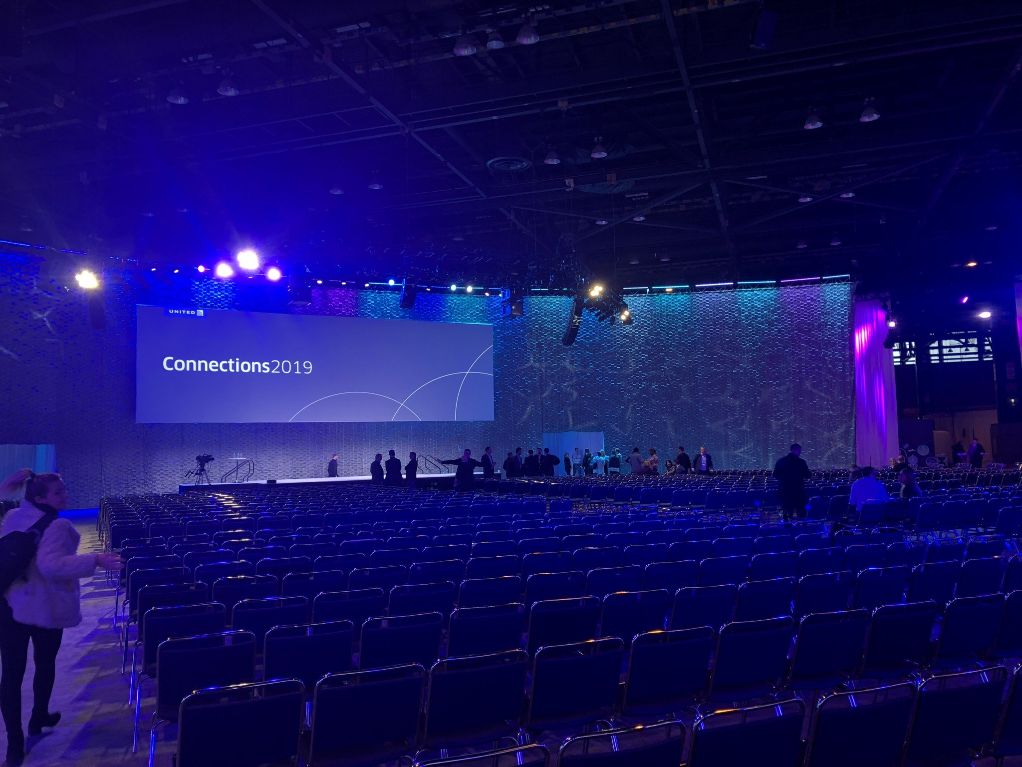
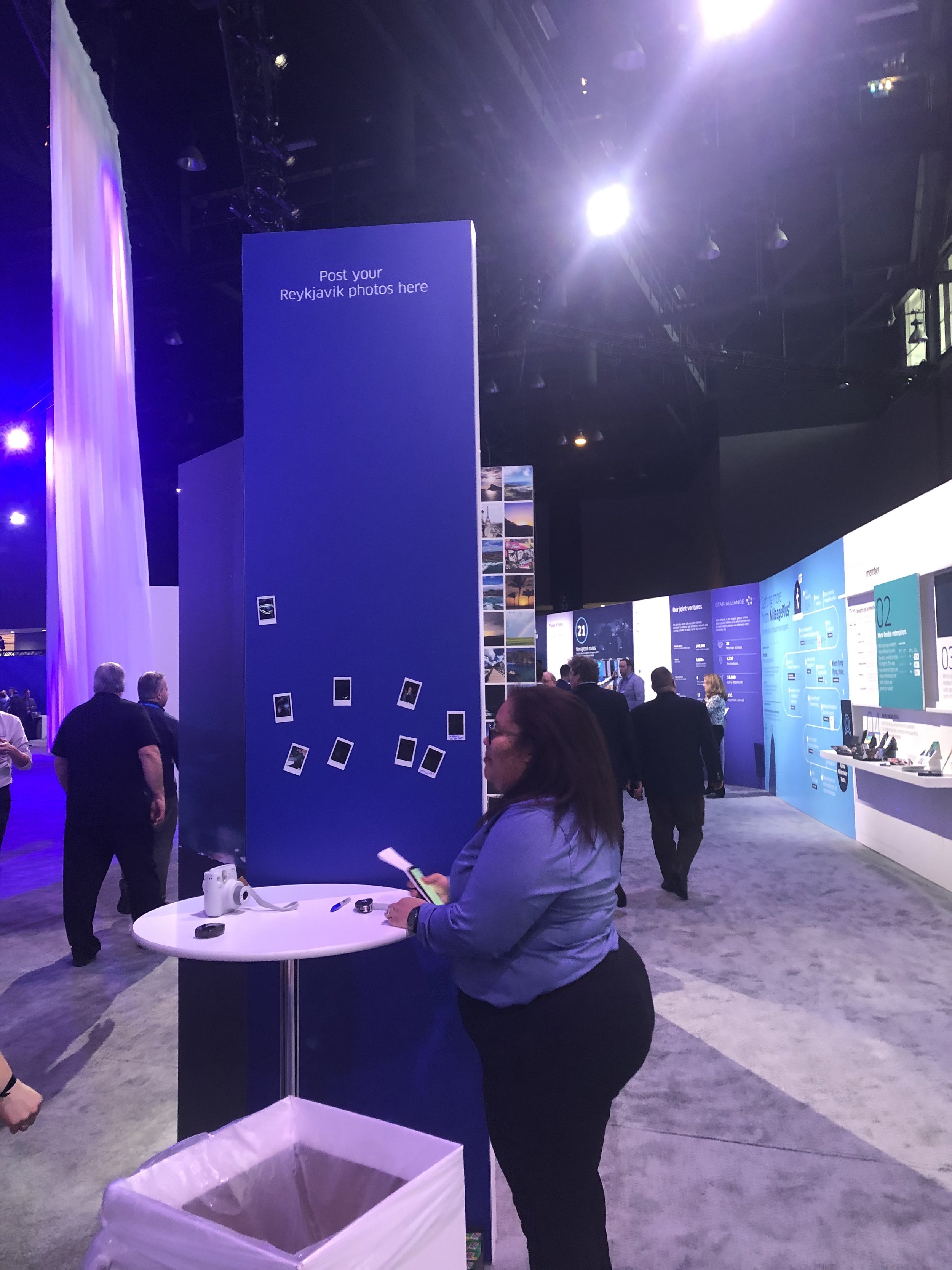
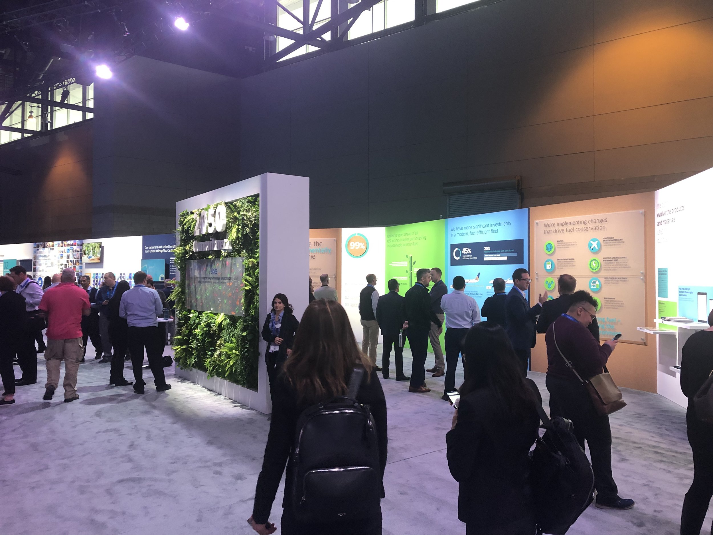
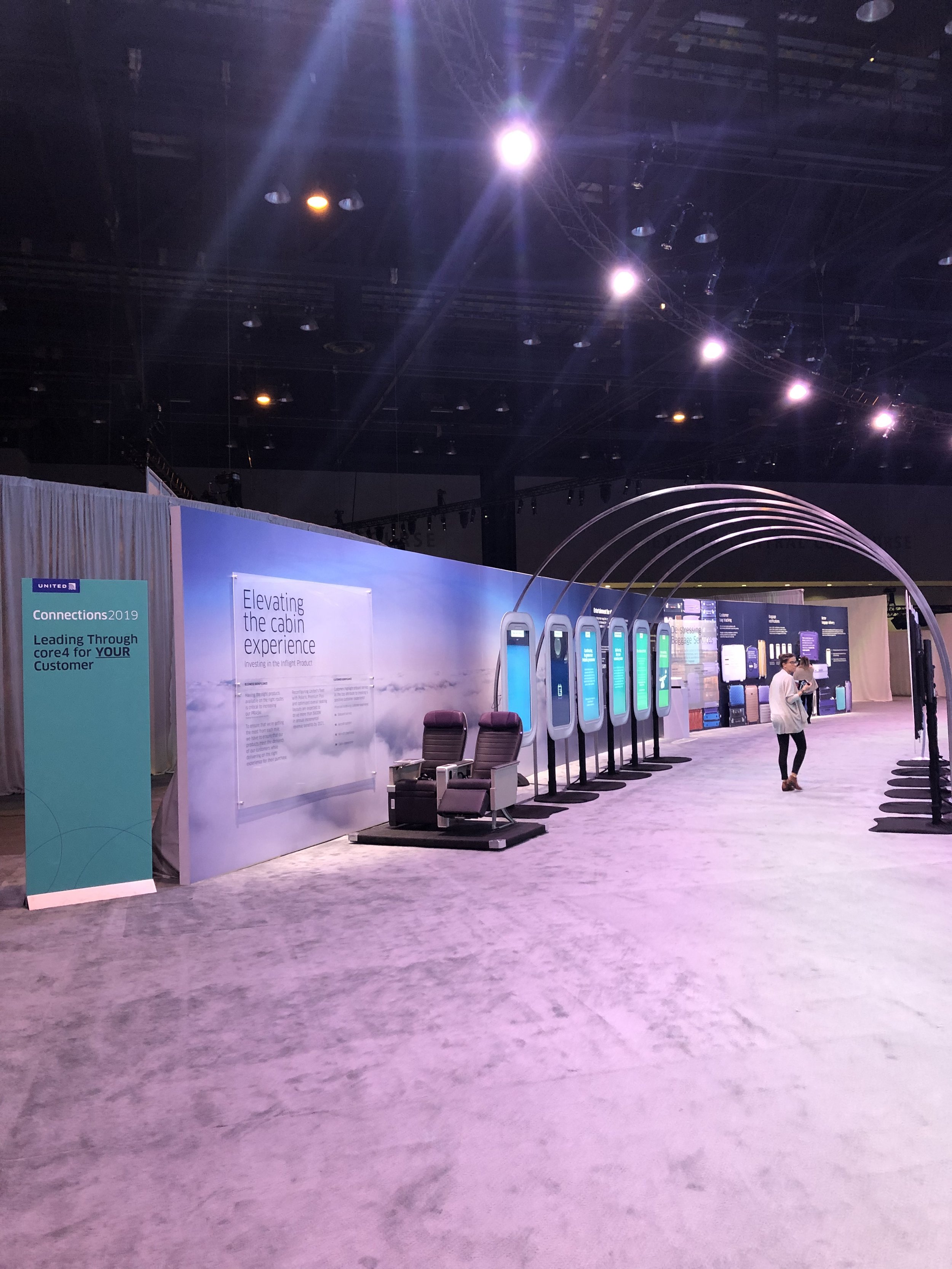
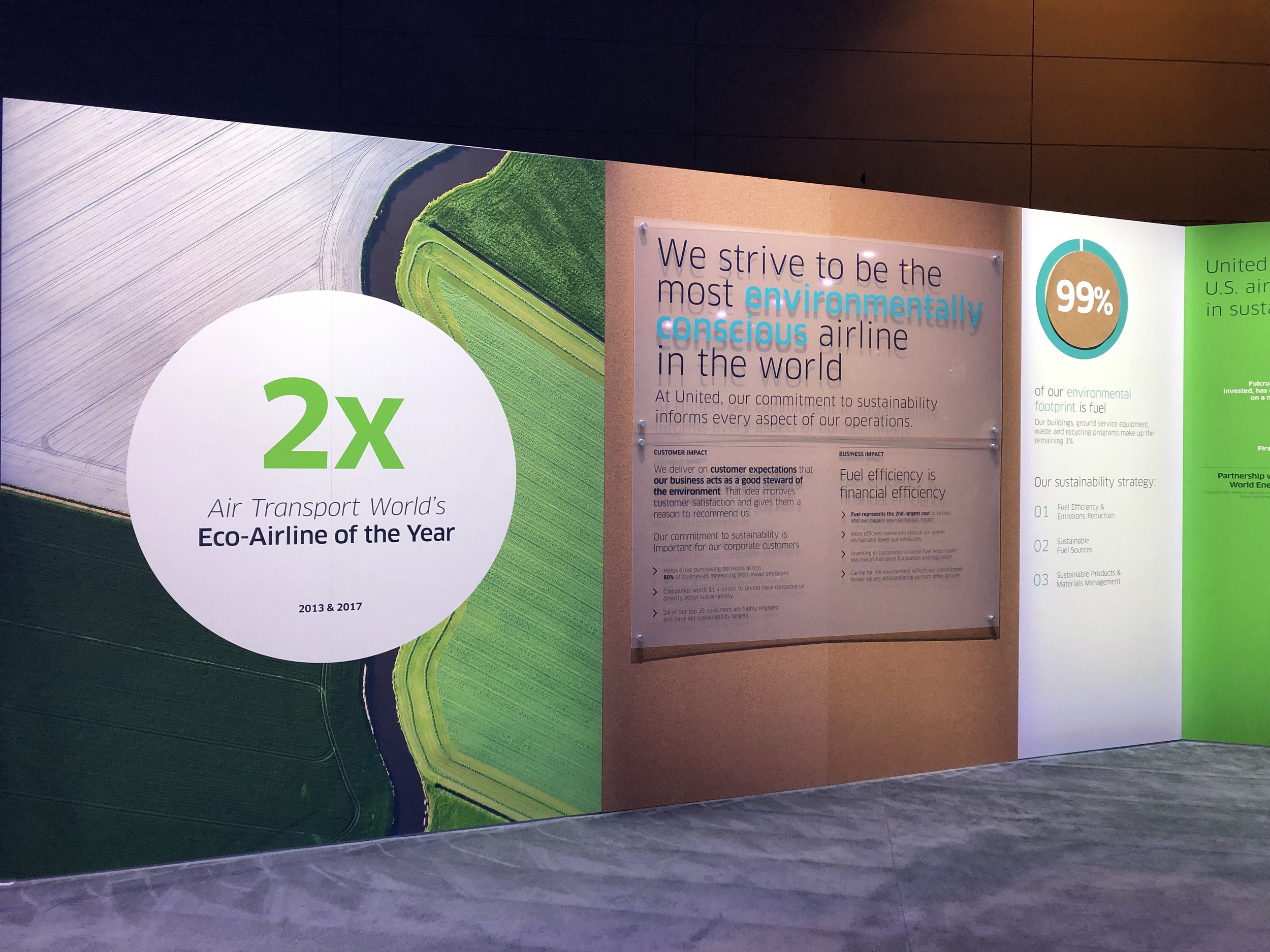
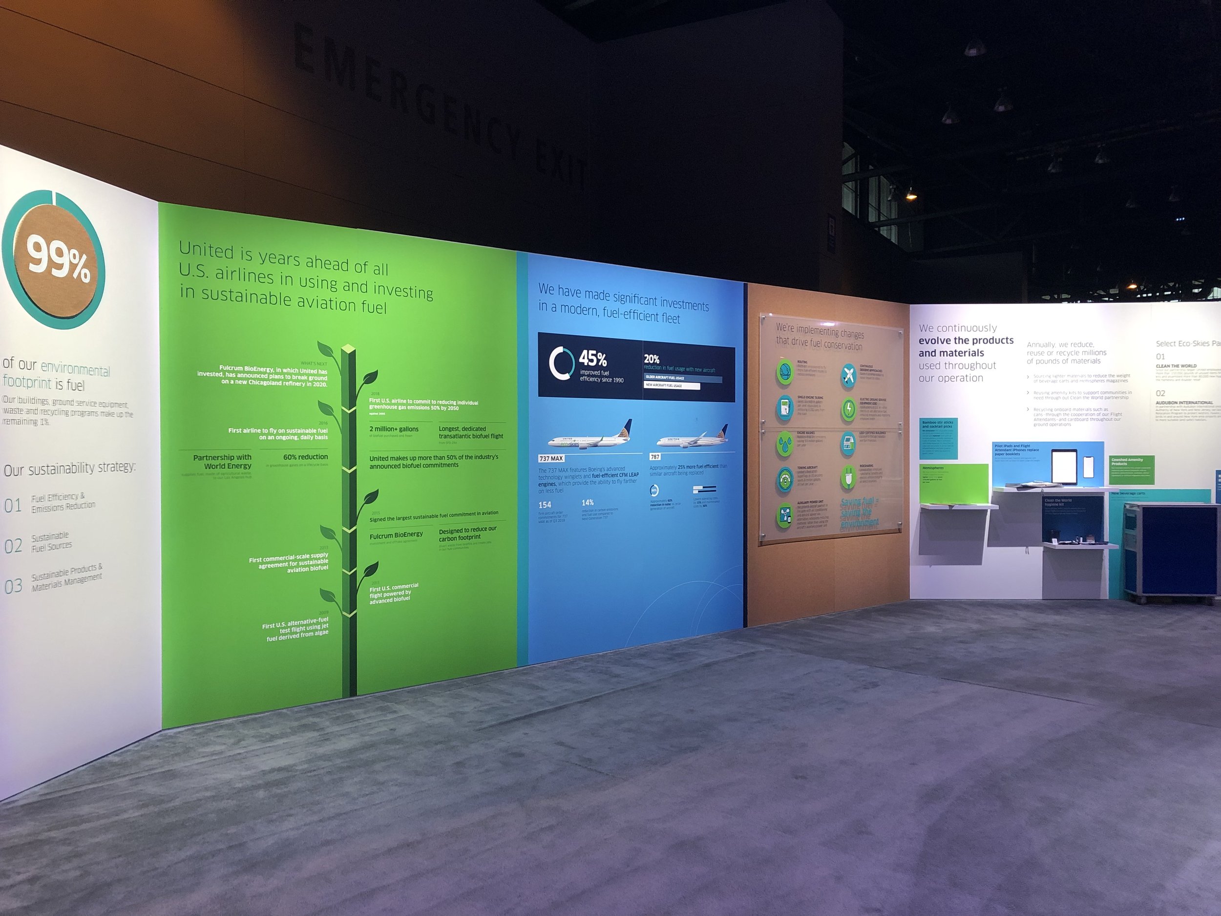
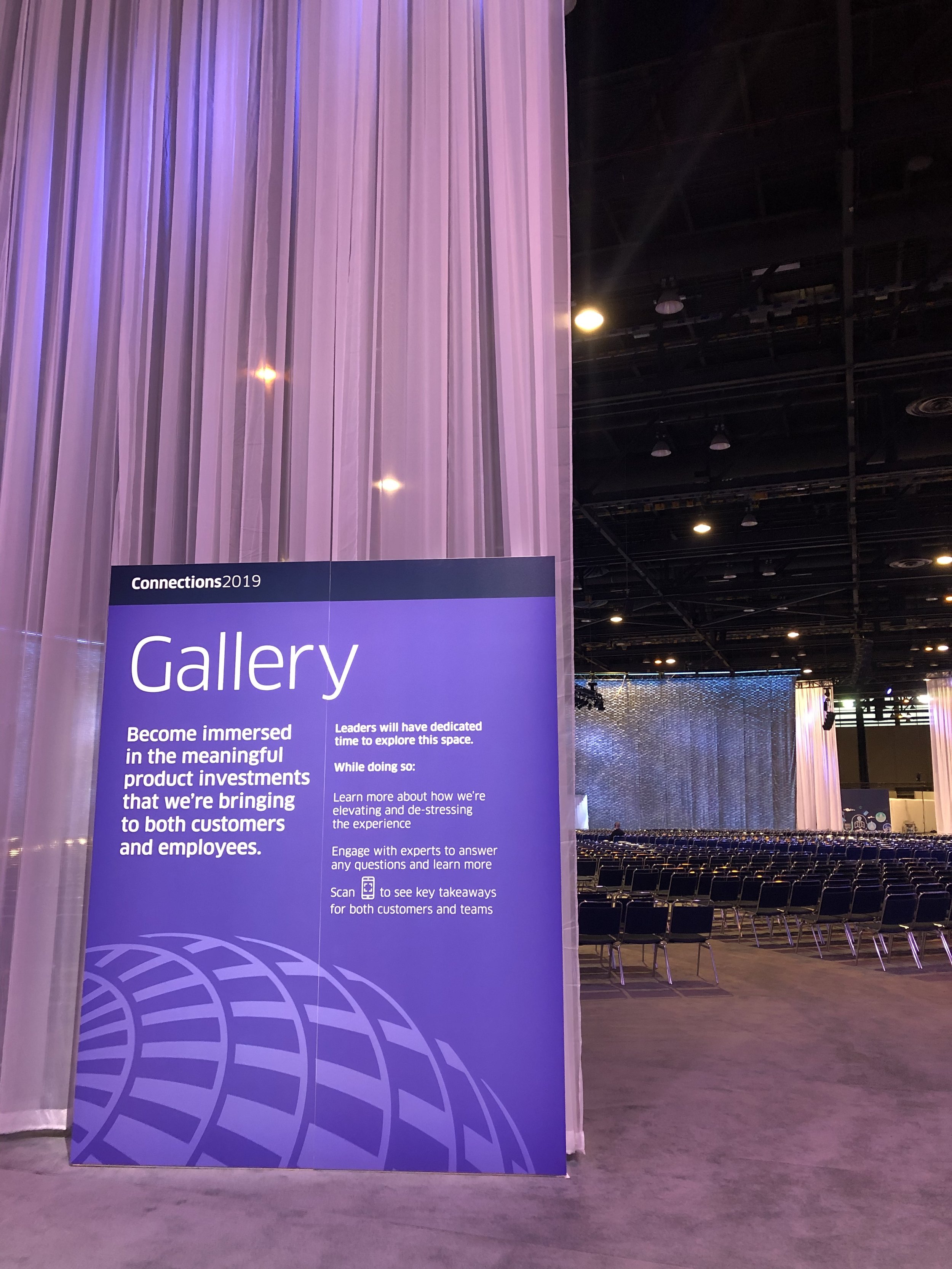
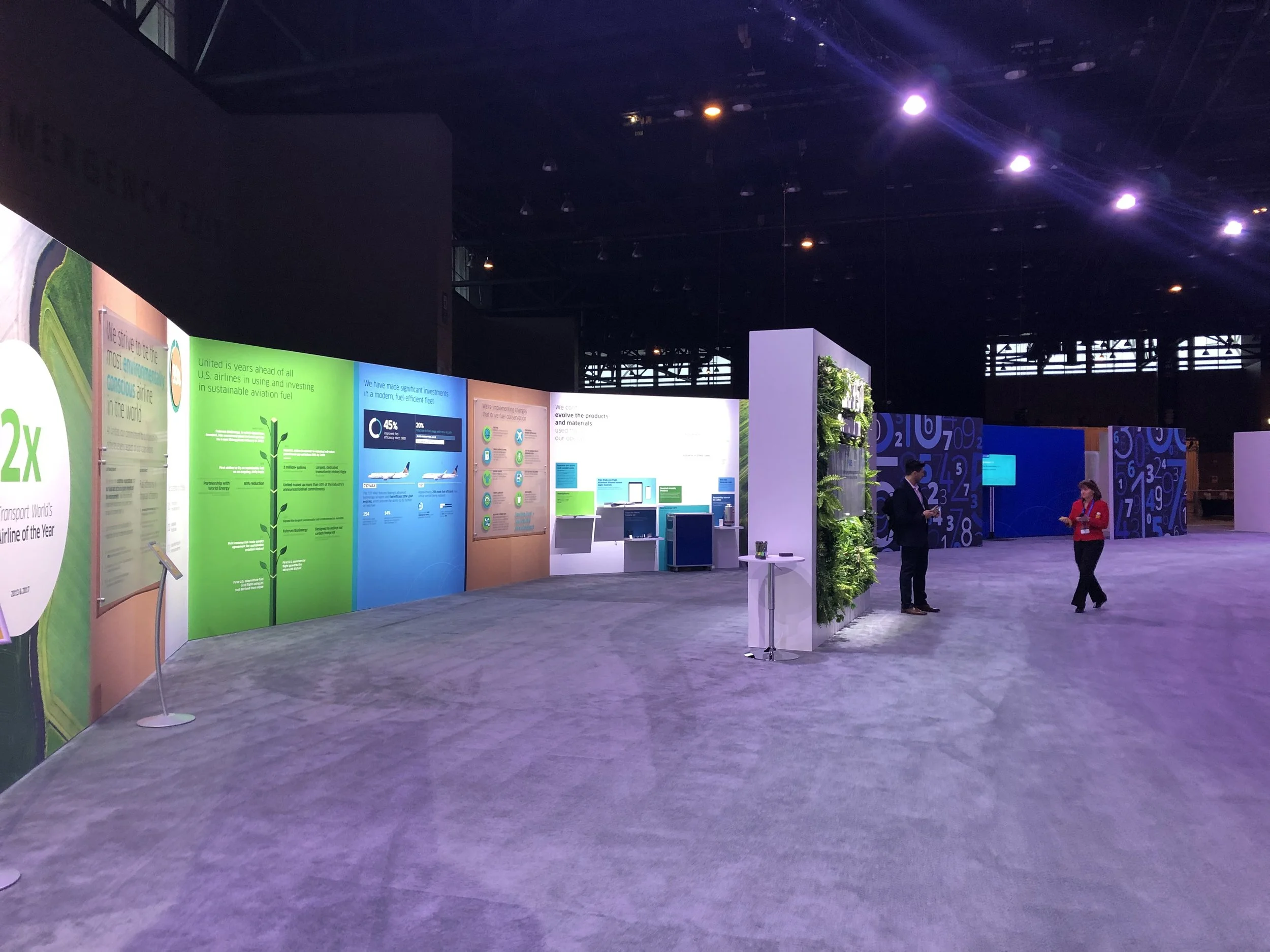
United leaders attended sessions in a mainstage conference arena, exhibitions in a circular surrounding gallery, and nine curated workshops on leadership, team-building, core values and more.
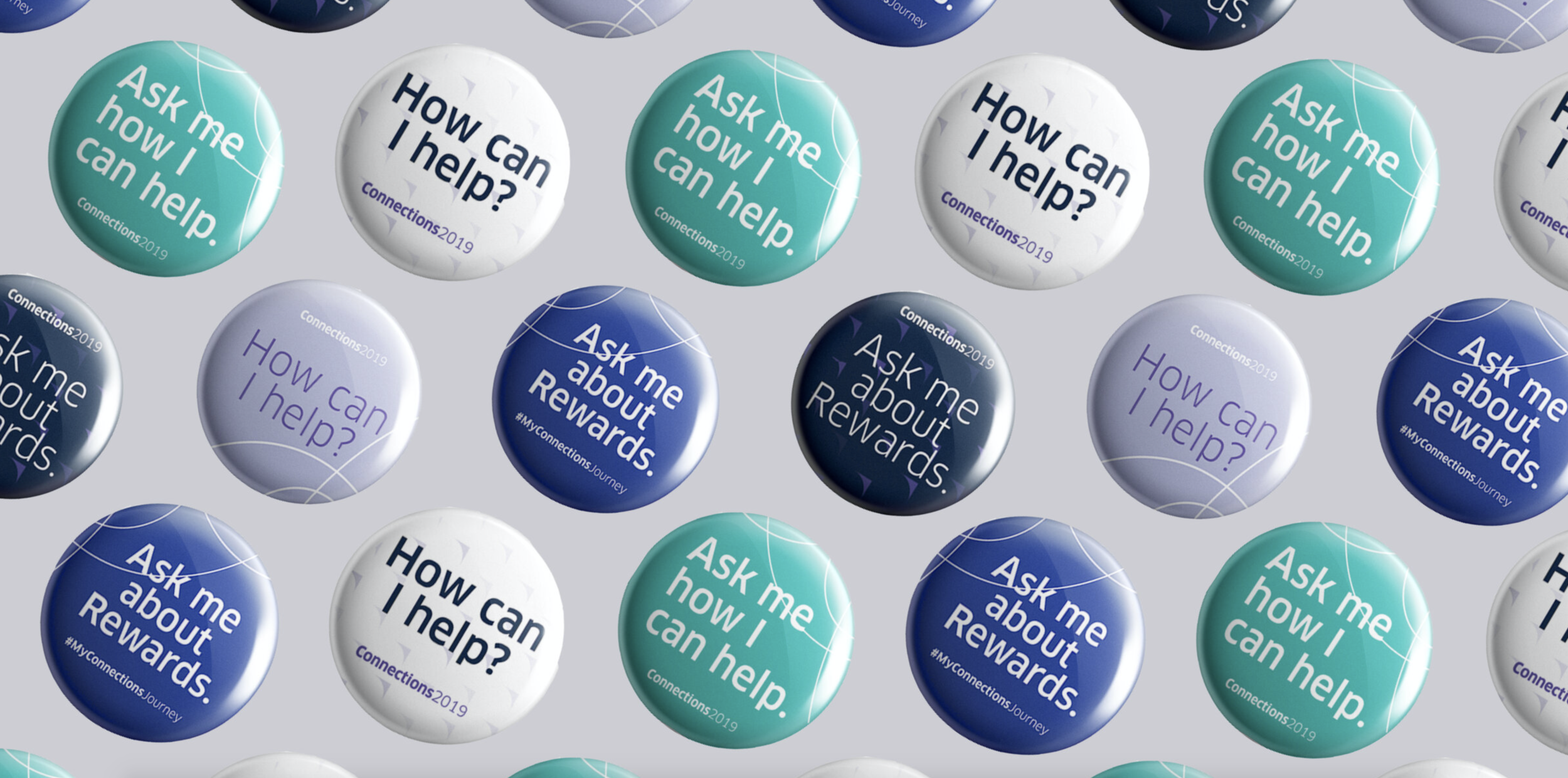

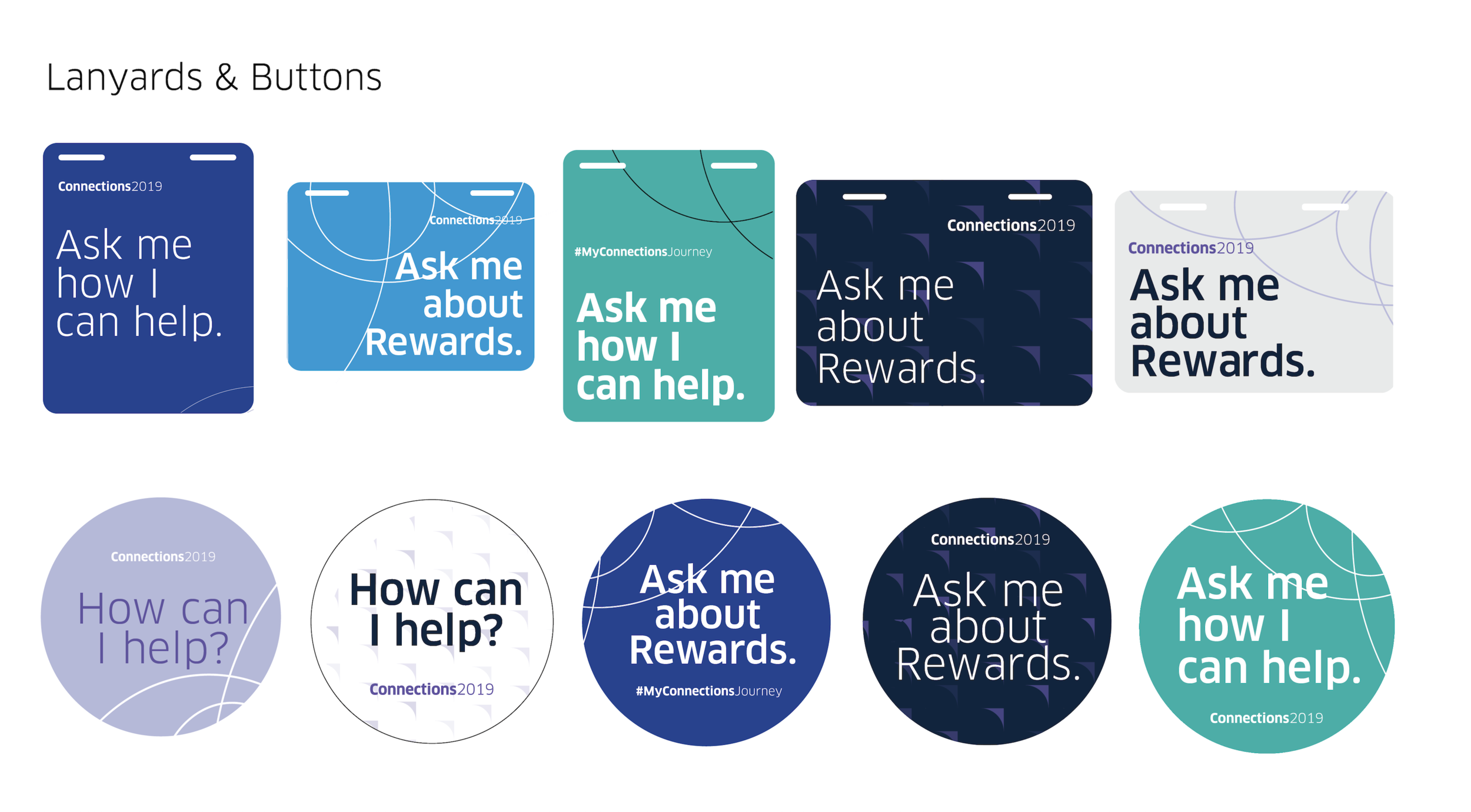

I was tasked with taking the brand identity of the Connections conference and extending it into our way finding signage, buttons and lanyards.
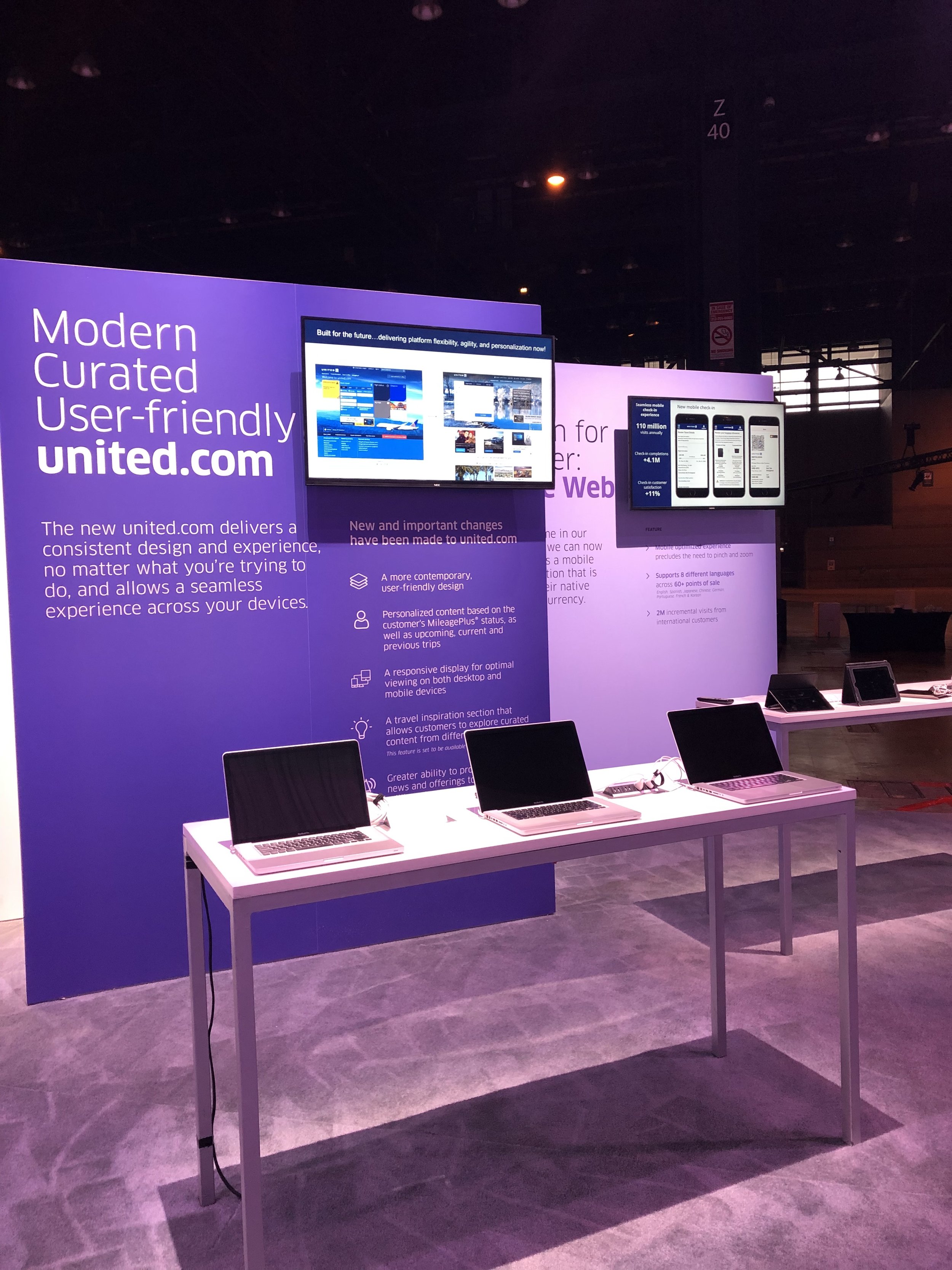
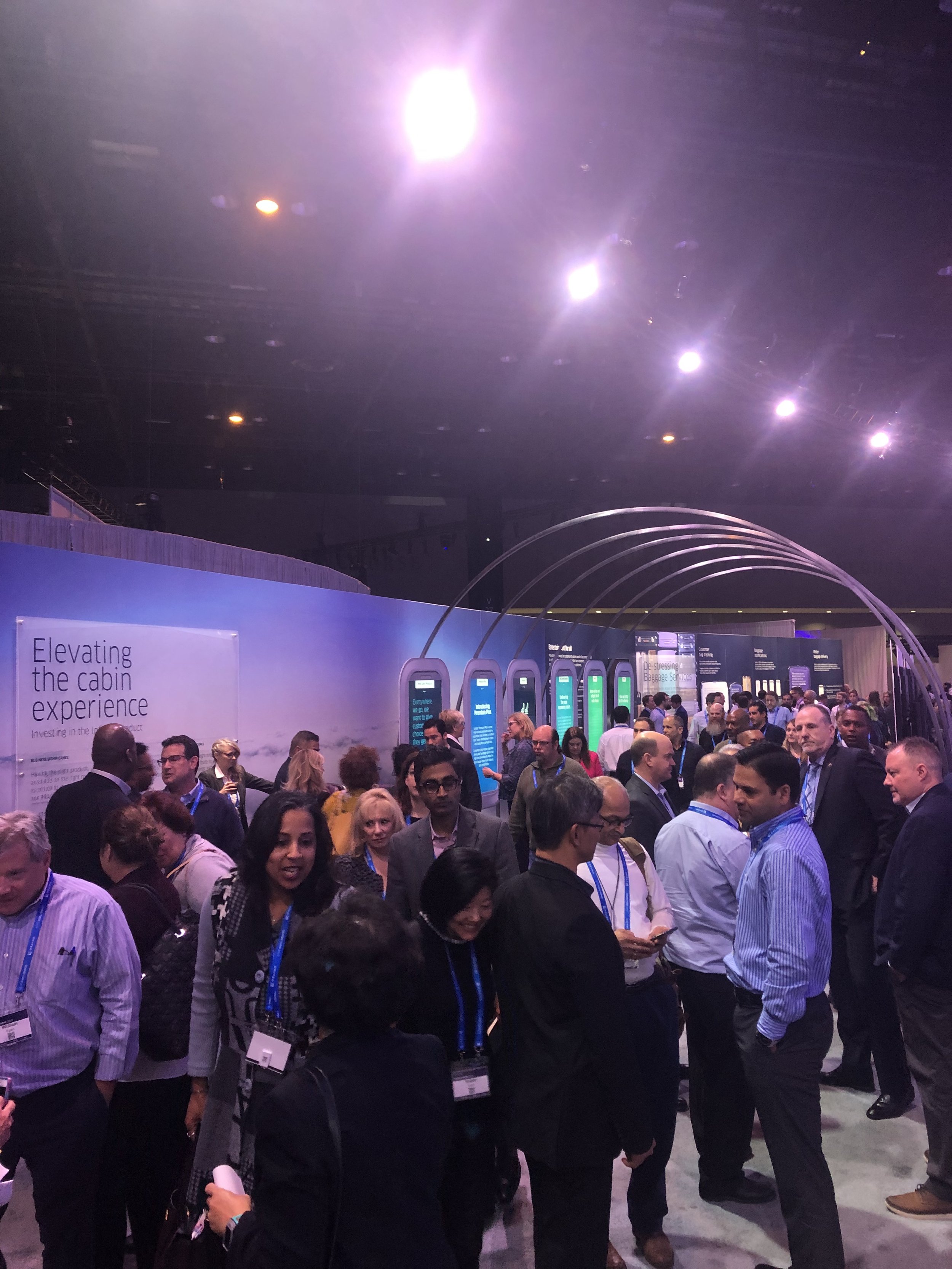
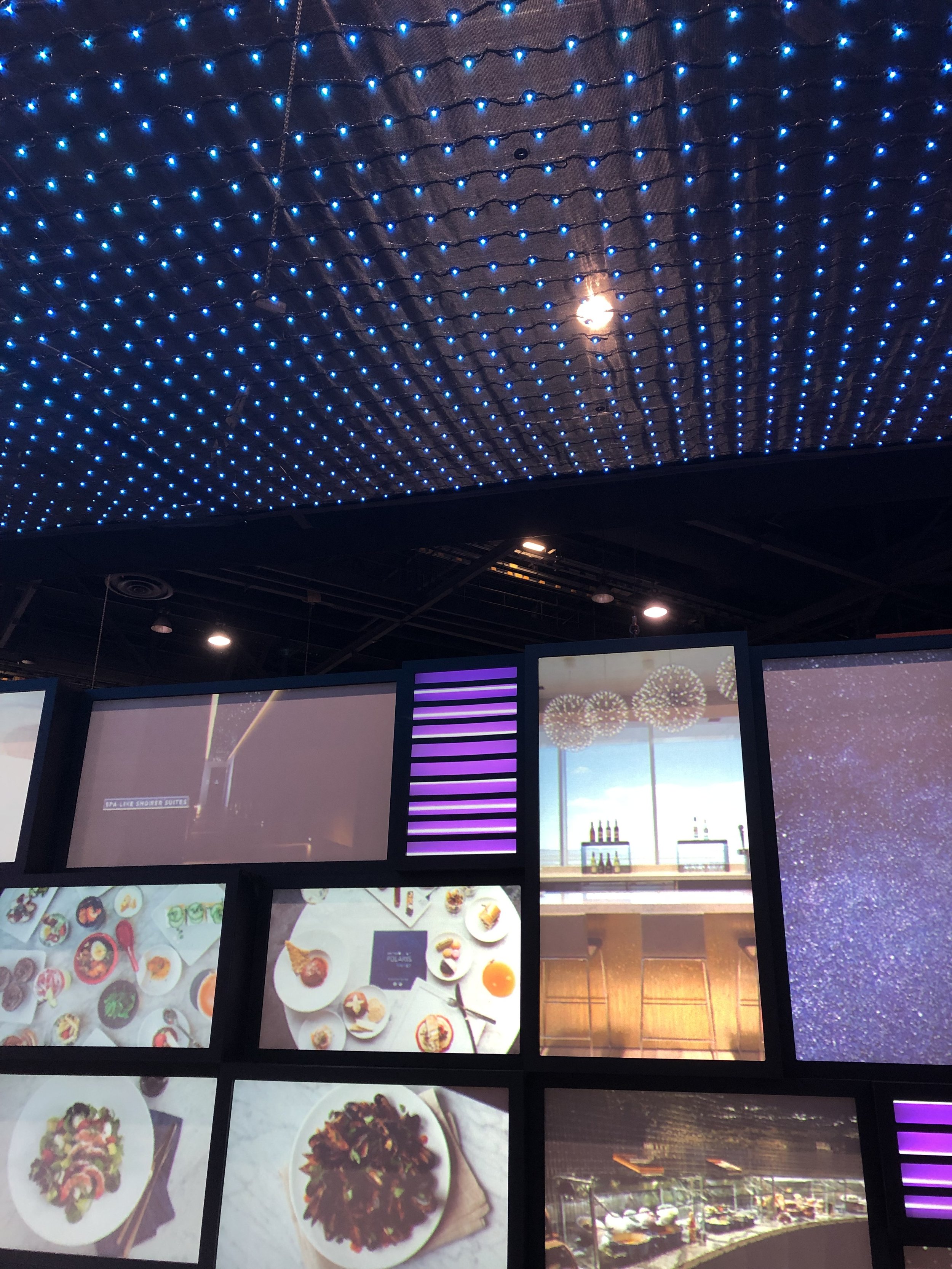
I designed the above installation for Uniteds’ app updates and integrations. Employees being able to experience the new features of both the app and website on desktop and mobile
felt like a crucial piece to include, as it primes employees
with knowledge ahead of its’ public rollout.
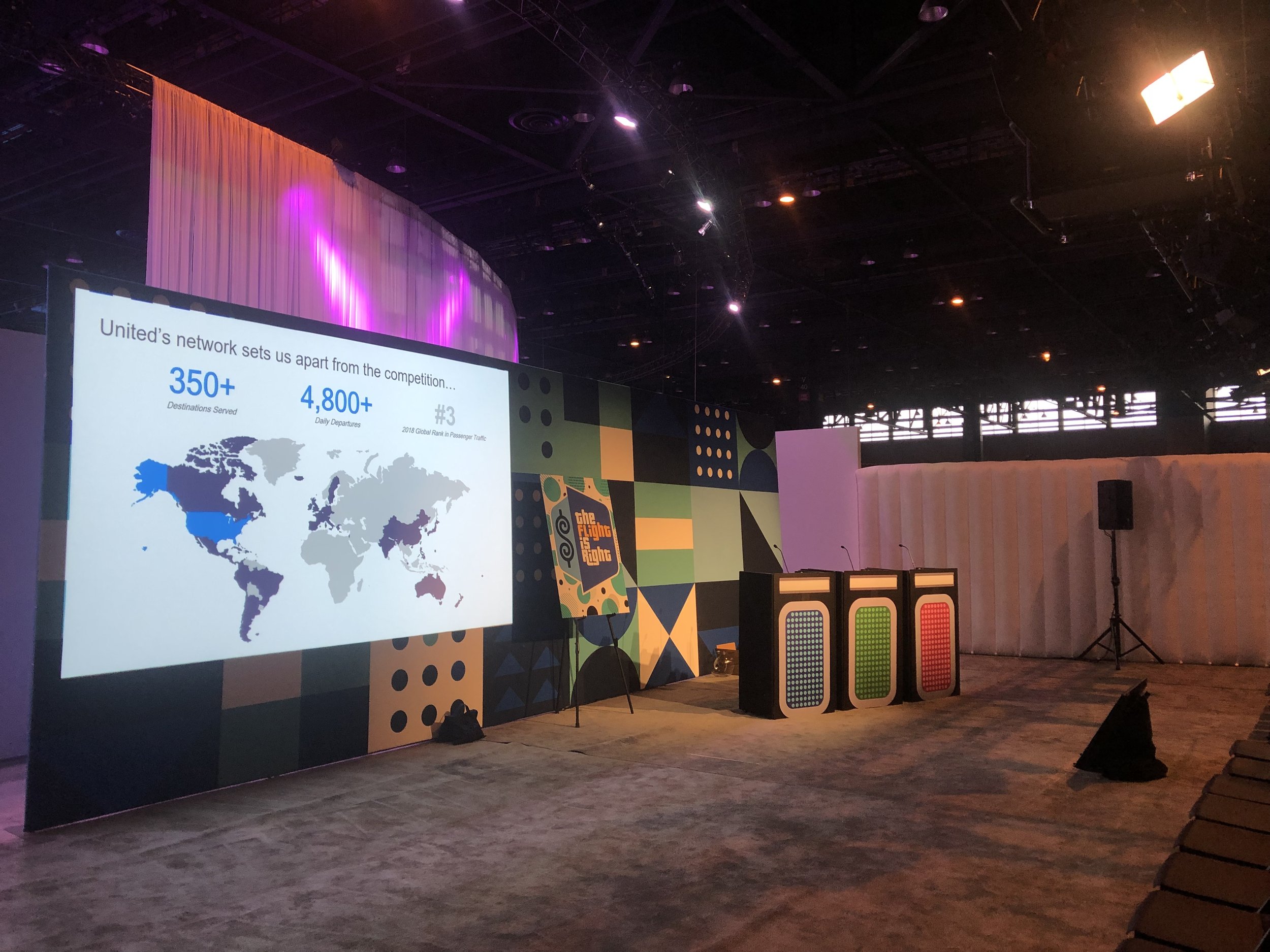
Our team designed and ran nine curated workshops housing over 200 leaders each.
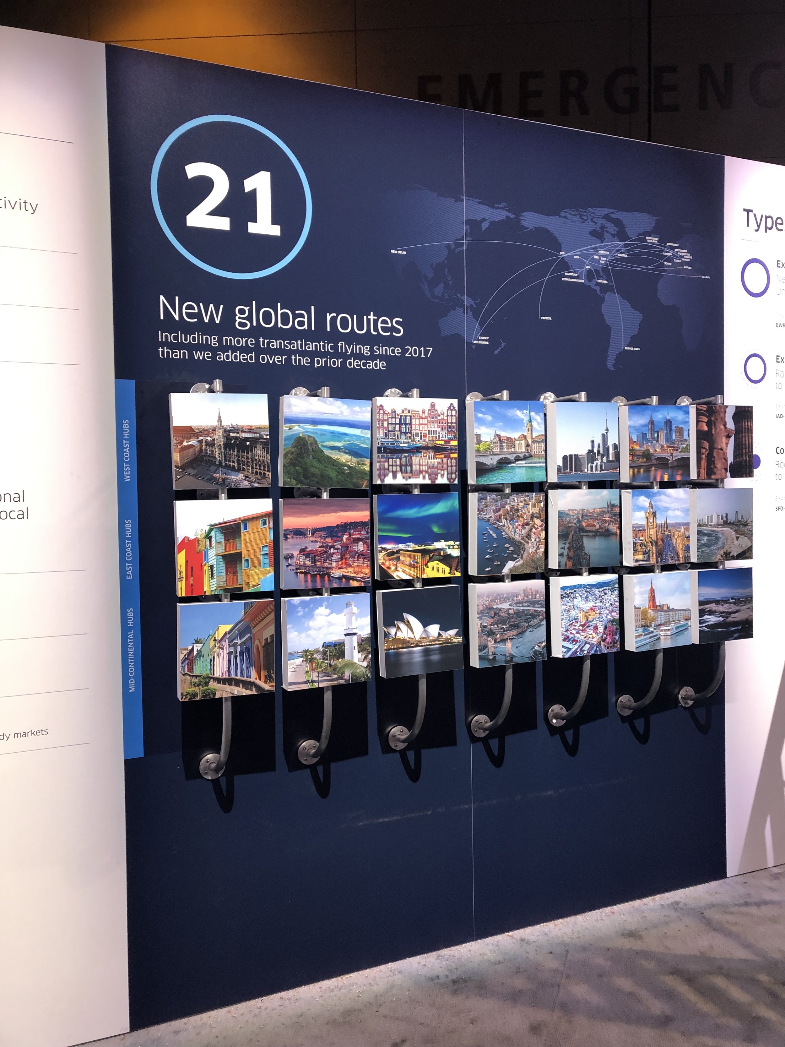
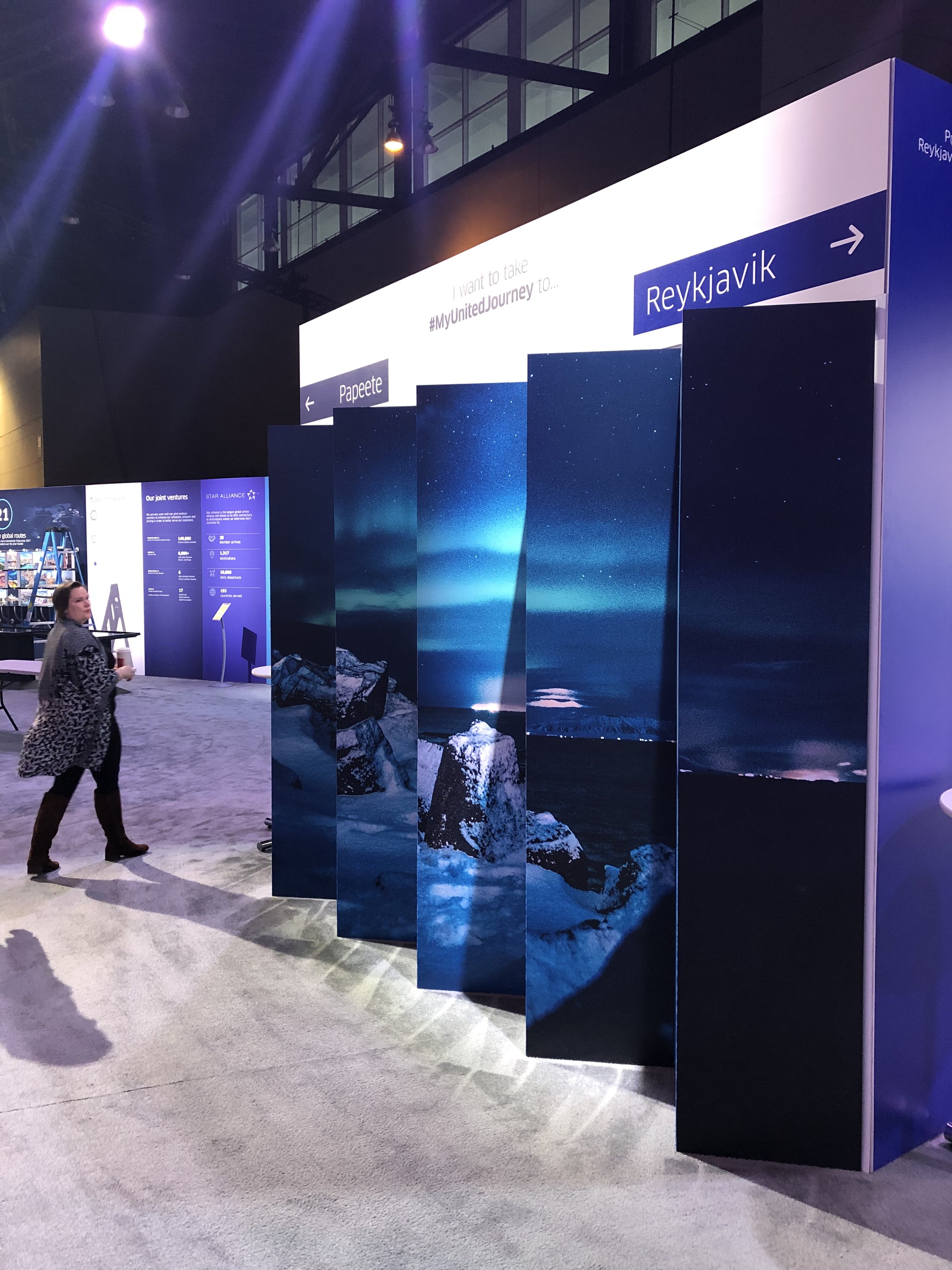
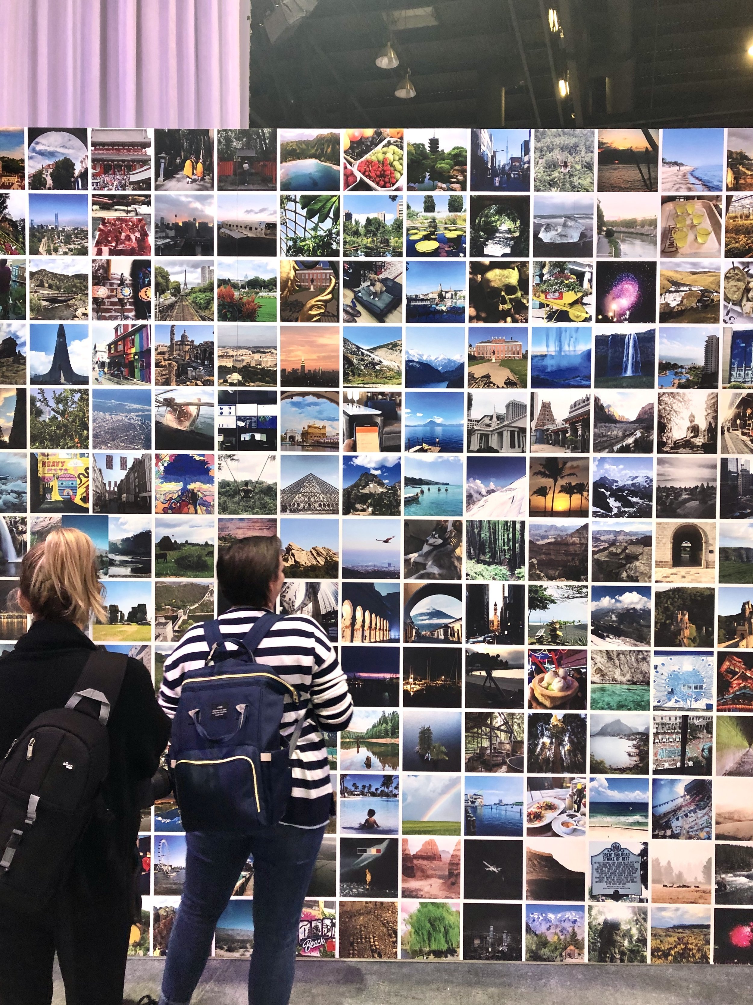
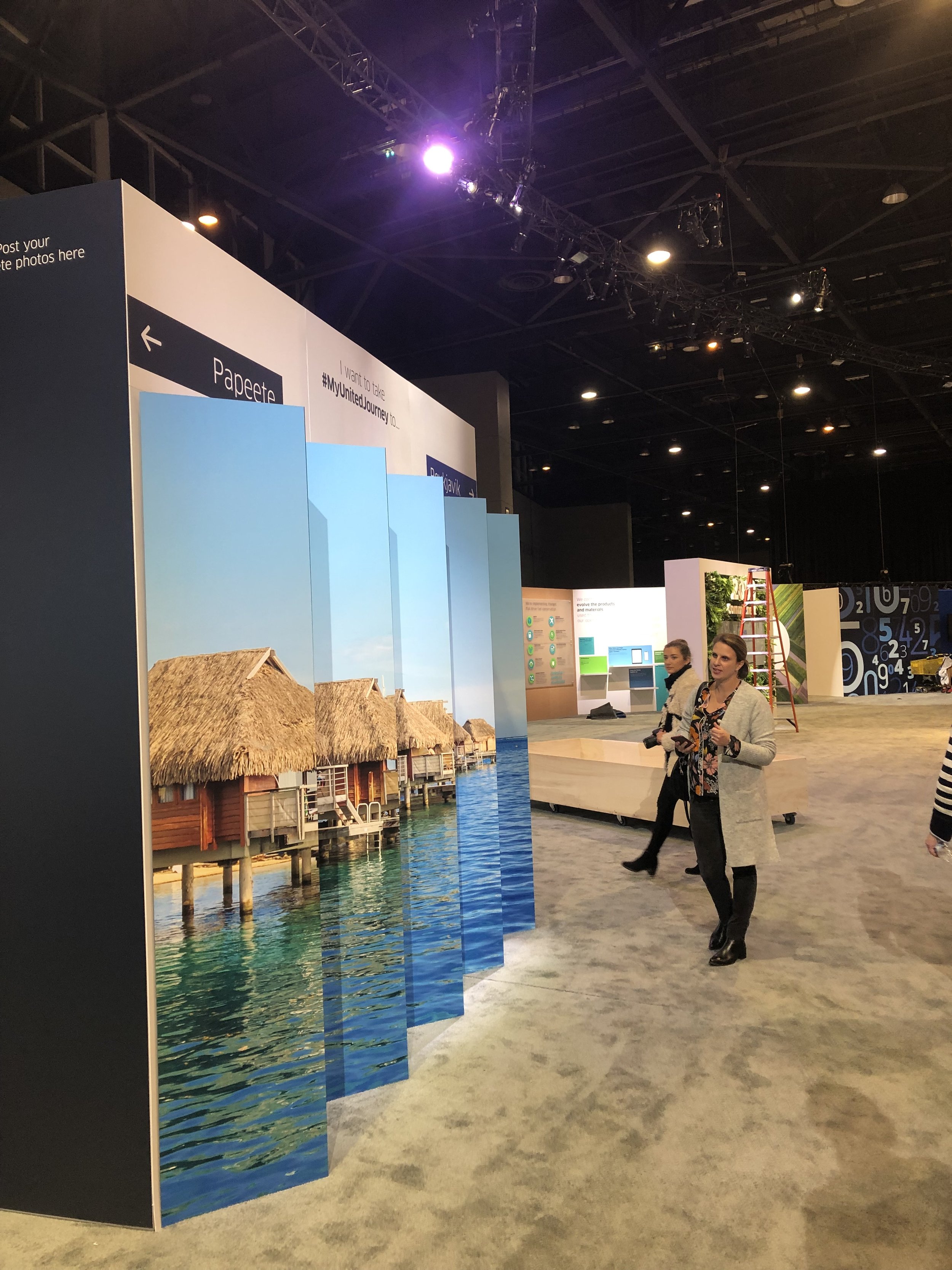
United wanted to display their 21 new global routes in a unique, interactive fashion. I pulled imagery from each location, created the above map showing all of the route overlap and worked on an interactive element that involved putting each destination
on a swivel to discover more information about each new destination. I also designed the main gallery way finding installation.
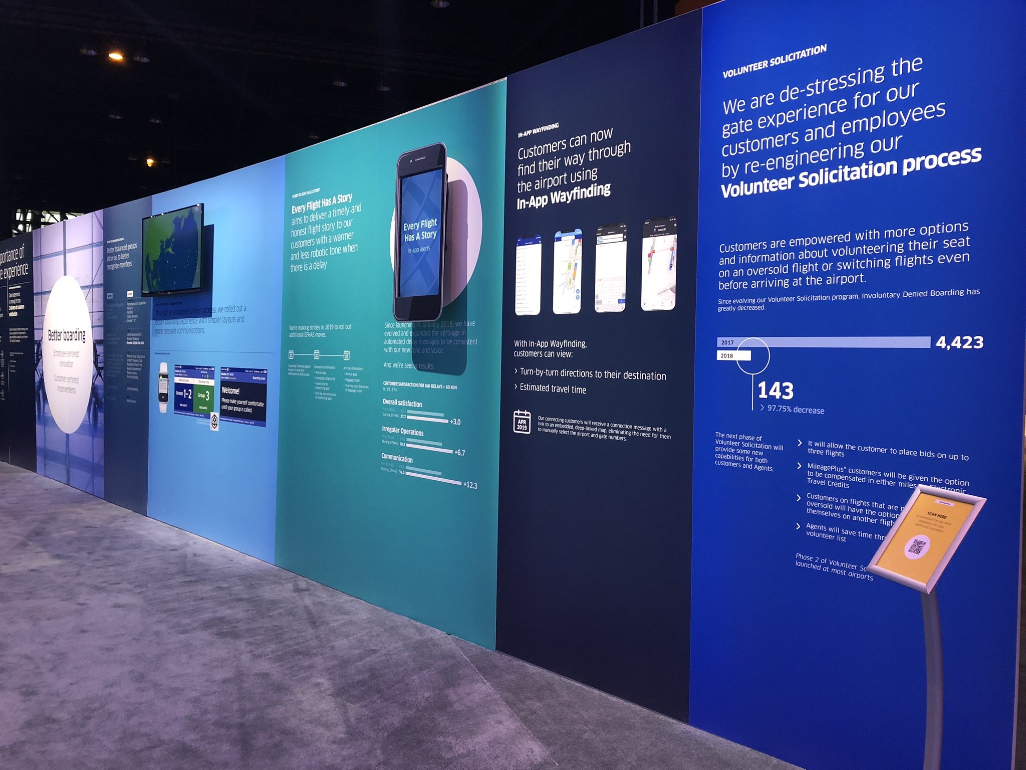
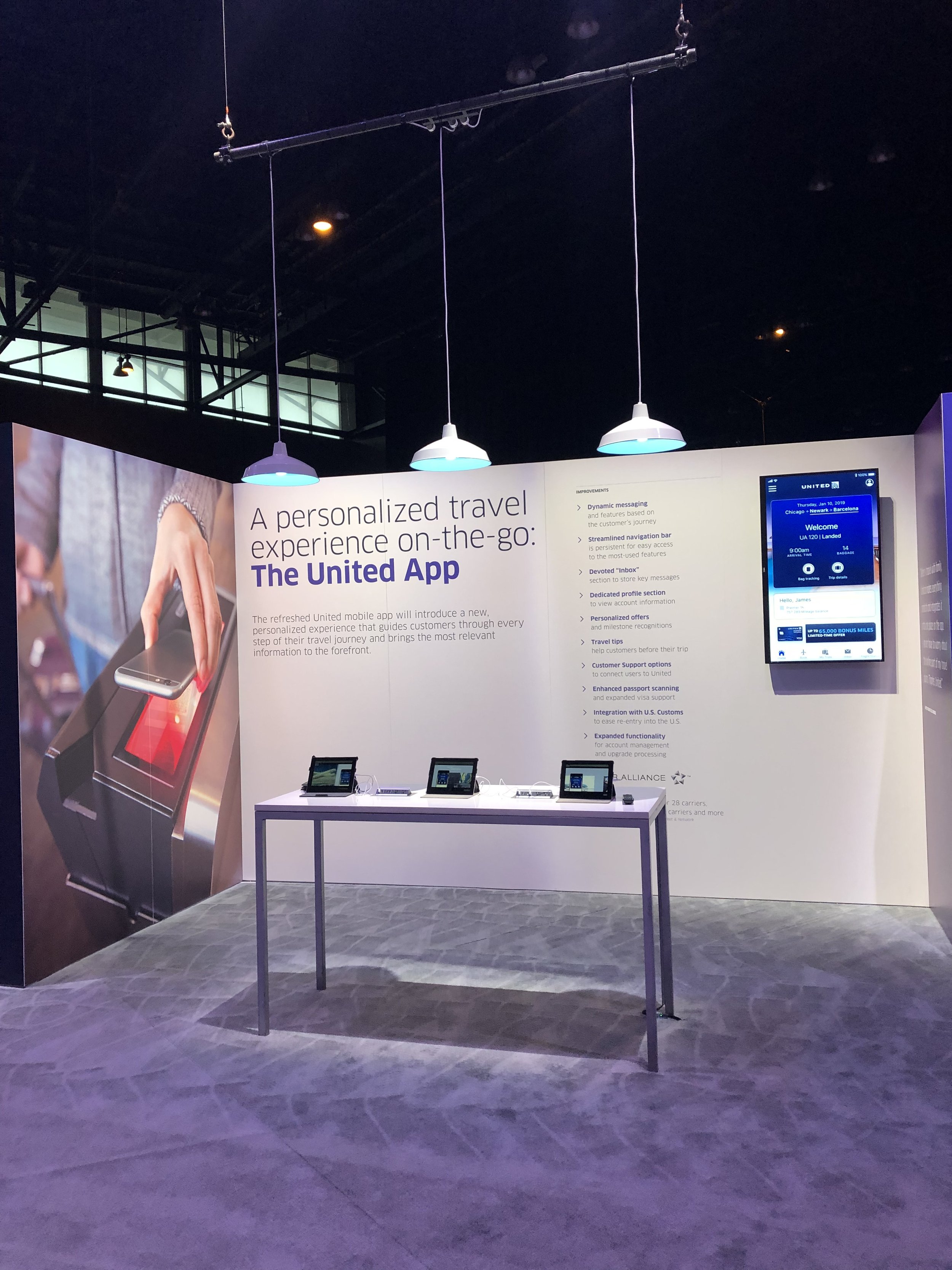
Connections 2019 was the perfect opportunity to show employees the new user experience of the United App,
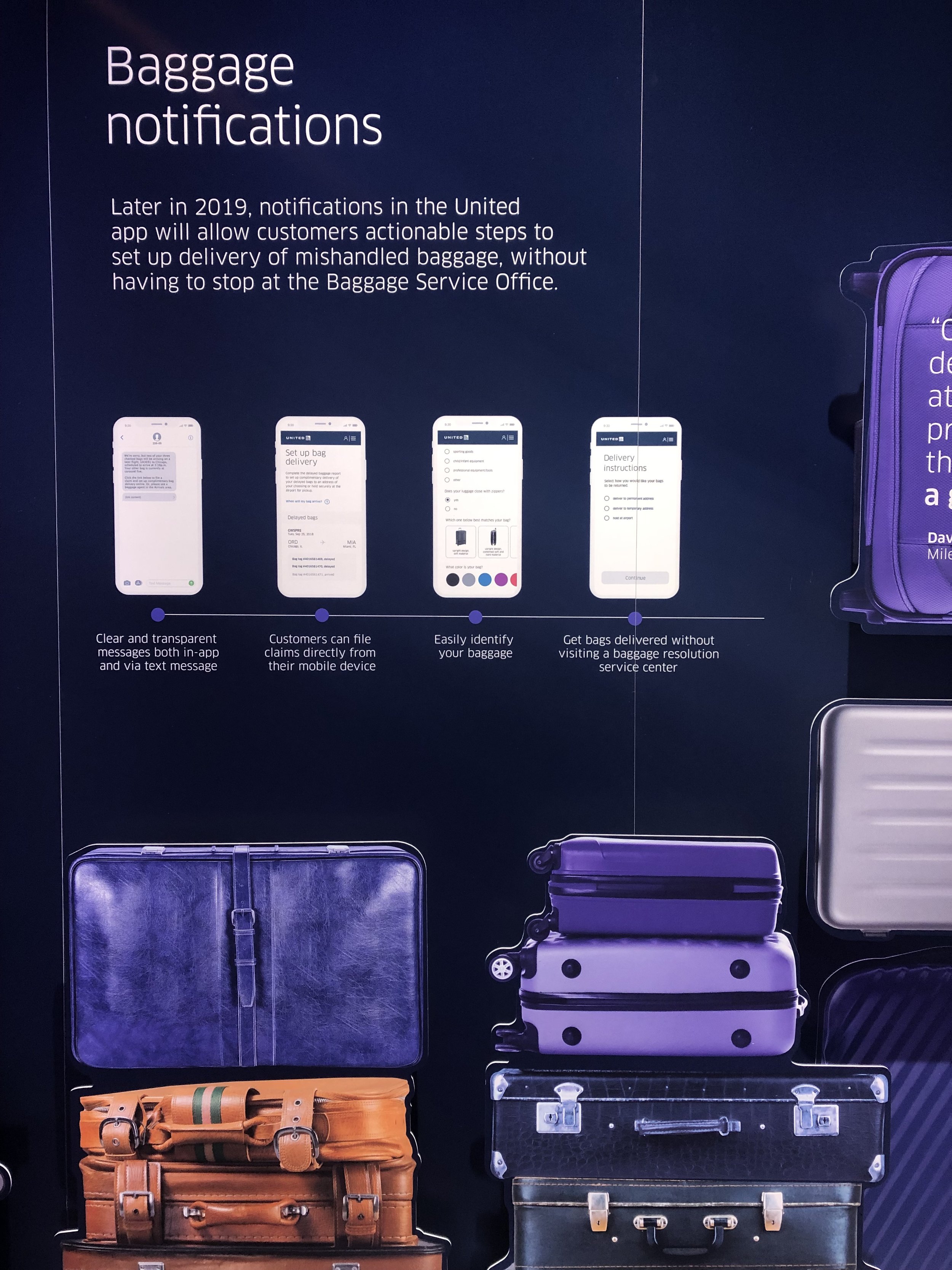
including a breakdown of how baggage will be more closely tracked through Baggage Notifications. I worked on the UX/UI breakdown of this notification system.
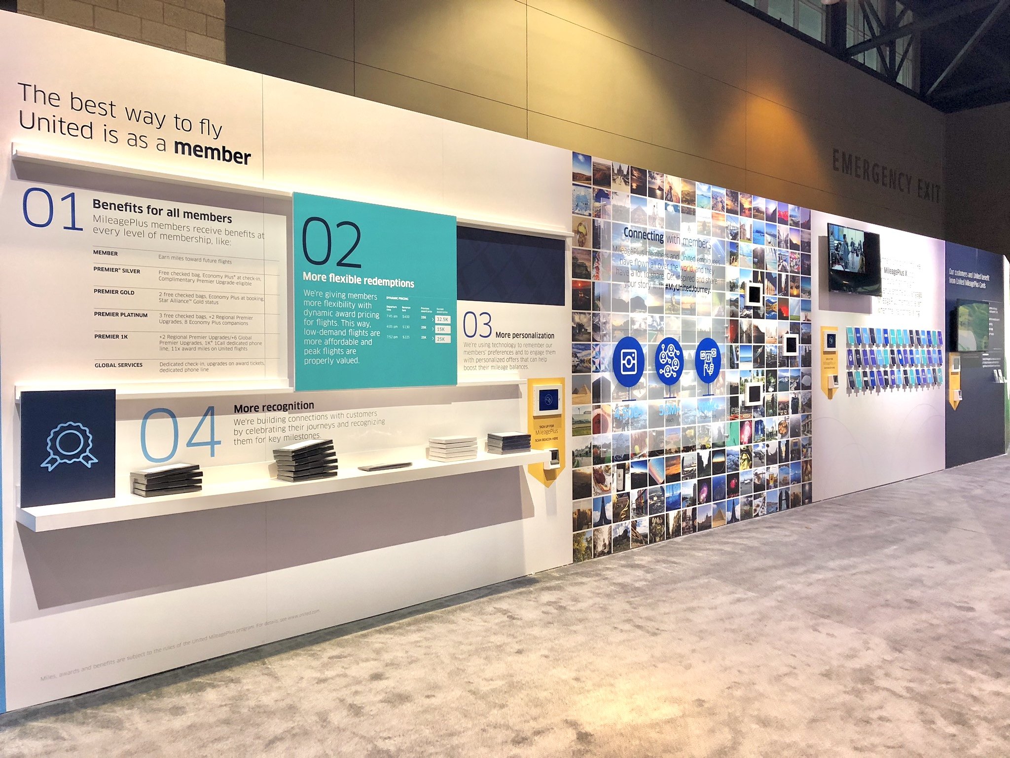
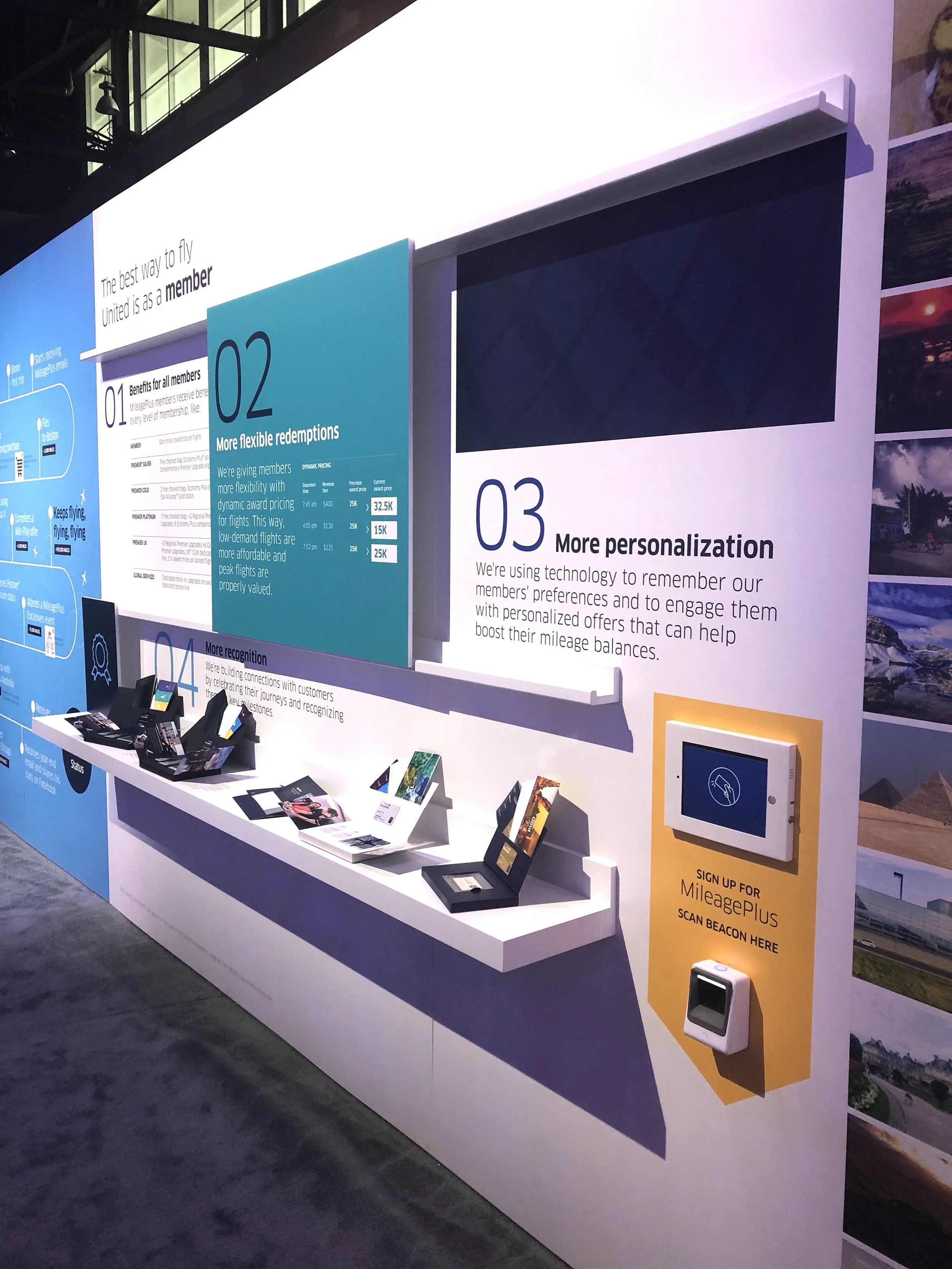
I designed the above United member installation, showing employees all of the benefits that come with signing up. Specifically, I designed an interactive pull-down system where people could see all of the benefits and brand perks that come with upgrading to Mileage Plus X status.
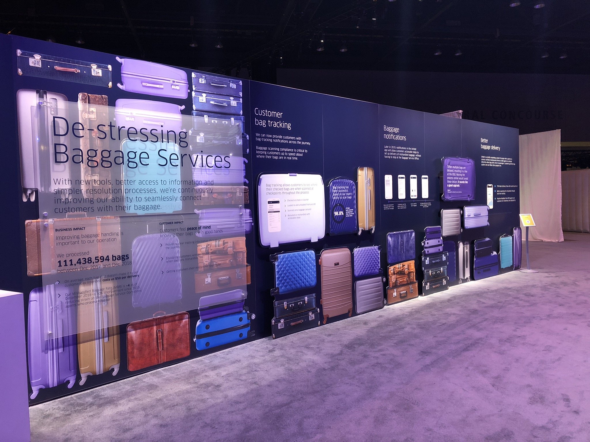
I created all of the text overlay on the De-stressing Baggage Services layout, utilizing baggage imagery as canvases to display text in an alternative way. Additionally, I broke down many elements of the new Baggage Notifications user experience on the United App.